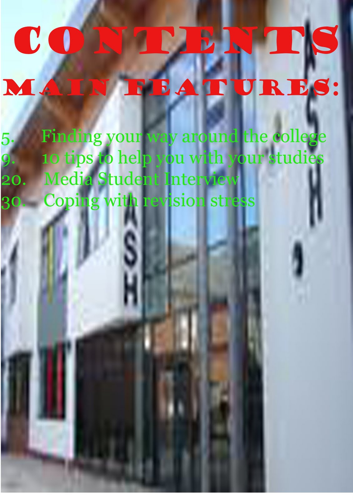
These is the cover and contents page from the preliminary task.
Friday, 15 April 2011
Evaluation
Joe Megson – Media Studies Coursework Evaluation
When working on this product, I went through a number of ideas. I am happy with the final product and believe I have created what I wanted to create.
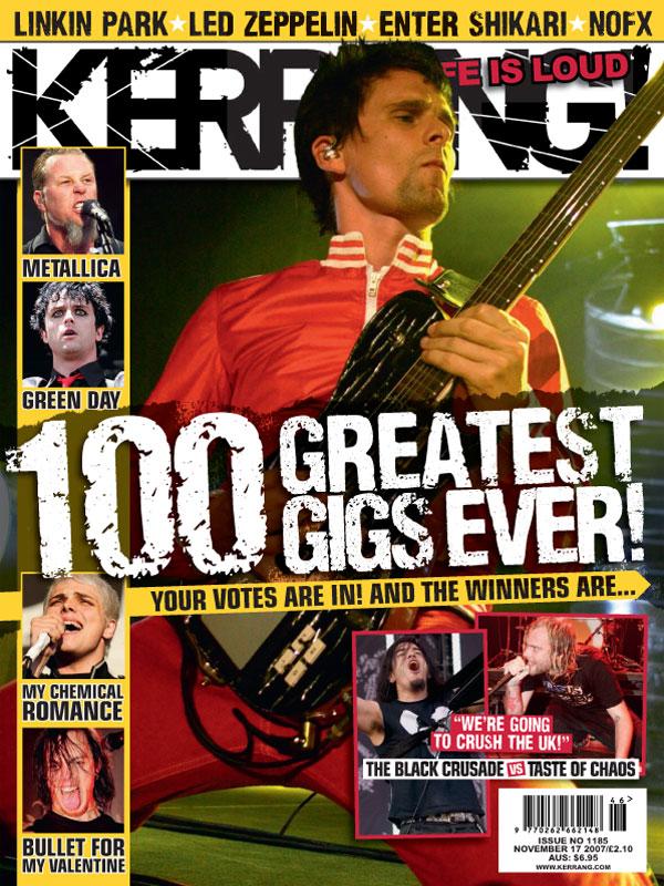
The planning stage of this coursework helped me develop my ideas, as I looked on the internet at existing products and based some aspects of my product on what I found. Particularly, the shot of a guitarist playing a guitar on the front cover is based on a similar picture I saw on the cover of an issue of Kerrang! Magazine. Similarly, my original front cover, with the four band members, was based on a shot of Oasis I saw in Q magazine.
My finished product and my original product are very different. Although I retained the classic rock theme, I only kept one image from the original product. I also changed the name of the magazine, and completely changed my double-page spread, due to negative feedback of the original product. I changed the title of the magazine from “Rock” to “Flashback”, as it is a far less generic, memorable title. The cover image was changed from a mid-shot of a whole band to a mid-shot of a single musician playing an instrument for two main reasons: firstly, because, in the original image, the individual people were clearly doctored into the same image, creating vast differences in lighting between the subjects of the image. Secondly, in the original image, the band members were merely standing stationary, creating a bland image which was neither related to the fact that it was a music magazine, nor would it catch the eye of any potential buyers of the magazine were it sold in shops. This was changed by changing the image to a mid-shot of a single person playing a guitar, removing the need for much editing, and giving it relevance.
The contents page was originally bland and plain, not containing much. I improved it, in my opinion, by firstly changing the image to a more colourful long shot of a band, allowing for the background to be in the image, adding more colour to the page. This also allowed me to take the image from that page and use it on the cover, as a mid-shot is better suited to a cover than a contents page, as the cover has a larger image, and, in order to get the attention of potential buyers and give a clear and immediate picture of who is featured in the magazine, the focus must be on the artist rather than the background of the shot.
Although the original double-page spread did not attract a great deal of negative feedback, I decided to change the double-page spread to the feature shown on the front cover. I decided to make the black background used in the double-page spread the house style of my magazine: a black background with red and white lettering. I chose this house style as it is aesthetically pleasing, as well as reflecting the rock music style. Another reason I chose this style is that red and black are the colours featured in the logo of the band AC/DC, one of my personal favourite rock bands, who are popular and well-known through my audience of adults who are interested in classic rock music.
I have followed a number of conventions of music magazines in the finished product. The cover features a mid-shot of a musician playing a guitar. Midshots are often used in music magazines to get peoples’ attention and make it immediately clear who is featured in the magazine, and my cover follows this convention. It also follows the convention frequently used in music magazines of having the names of bands and features in the magazine along the bottom of the cover, and the conventions of straplines both below the masthead and the banner headline.
The strapline “No Download Required” references the digitalisation of music, and the fact that the magazine is based around classic rock music, which existed, and was most popular, before the rise of digitalisation. This may appeal to my target audience of adults interested in classic rock music as they will have listened to the music on vinyl records and CDs. In this way, the strapline helps build nostalgia, a reason why people may buy this magazine.
My cover page is also quite conventional. It maintains the house style of the other pages, and is split into two different groups: new features and regular features, as is the case with many magazines, not just music magazines. The image of one of the features in the magazine and the editorial note are also often used in other magazines.
The double-page spread is conventional, with a large image taken up half of it, and a headline containing a quote from the musician across the top of the pages.
My magazine gives a positive representation of the social group of working-class people. The musician featured in the double-page spread and on the cover, according to the interview, began busking in the city centre before becoming famous around the country. The article claims that he is among the best tribute acts in the world and describes him with respect despite his lower-class status. It is, however, implied in the interview by the musician that he now has quite a large amount of money.
I believe that, were it a real magazine, the magazine may be sold by Bauer Media. As I learned during the planning research stage, Bauer Media produce a variety of magazines, including magazines like Q. This magazine is similar in some ways, as it too is a magazine about rock music, but also fills a niche in a market: classic rock music, of which few magazines exist, also found in the planning and research stage. Alternatively, it may be a (quite substantial) supplement to another magazine, as it is a lower-budget magazine which does not feature interviews with big-name classic rock bands which are still around today, instead containing features on the history of the genre and readers’ opinions. As for interviews and other such features, the magazine focuses mainly on tribute acts.
The audience for my magazine is primarily adults who are nostalgic for past music and may not be inclined towards contemporary rock music. This is reflected primarily in the musicians featured: tribute acts who play classic rock music, as well as articles and contests related to classic rock bands, such as the history of rock mentioned on the contents and cover pages. Nostalgic adults who listened to rock music in the past may enjoy reading this as it would remind them of earlier years. My audience would be mostly working and lower-middle class, or the C2 and D SEG demographics. This is because the chosen music genre is not often considered a “high” genre, like classical music, for example. The class of my audience is reflected in the magazine’s low price of £1.99, as well the positive representation of a lower-class musician in the double-page spread’s article. The contents page also does this to a lesser extent, with the image of the band members of AB/CD sitting and relaxing in a field, rather than somewhere like a large venue or a house.
Through creating these media products, I have learned how to create and manage an online blog. Furthermore, I have learned to use Photoshop to some degree by moving, cutting, resizing and erasing parts of, images for use in my media product. I also used a scanner to upload hand-drawn drafts to the computer something I had not done in previous coursework pieces. However, the final product was very different to the hand-drawn drafts.
In my opinion, I have learned a great deal about the creation of such a media product as a magazine since the preliminary task. For example, in the finished product, I edited the background out of the original photograph which I then used for the cover. The cover I used in the preliminary task still contained the background of the original shot, creating a non-eye-catching image, which also included the subject’s shadow. These problems were fixed through editing the shot in the finished product. The contents page in the final product is also considerably better than that of the preliminary task. The original contents page contained a blurred image taken from the internet and one large list of contents. The final product contains an original photograph, which does not take up the entirety of the page and so does not make the contents harder to read. The contents are also divided into two sections, making it easier for readers to find regular features of the magazine. This was not done until the final product. Another aspect I included in the final product was the use of a consistent house style.
Overall, I am happy with the finished music product. I think I have followed the conventions of music magazines effectively to create an eye-catching, entertaining music magazine which reflects and attracts its target audience well. I believe it is a vast improvement on the original product in its representation, cover effectiveness and overall visual quality. If I were to do this task again, I would produce more planning in the planning and research stage, so that I know exactly what I want to include in the product, and not have to make a drastic change late into the task, as I had to do in this case due to negative feedback for the original product.
Thursday, 14 April 2011
Monday, 14 March 2011
Friday, 11 March 2011
Theme Change
I have decided to change the feature of the magazine from the tribute band AB/CD to a collector of vinyl records. The double-page spread will contain part of an interview with the collector, along with images of the collection. It will be easier to get good pictures of this than a group of people.
Ideas for magazine titles
One of the criticisms of the magazine was that the title was not catchy enough. I have written a list of possible alternative titles:
Sound
Classic
Oldies
CR Magazine
Heavy
Voltage
R
Flashback
Vinyl
I think that these titles are better than Rock Magazine, and are all related to the product and style of music. I would have included "Classic Rock Magazine", but this is already an existing magazine.
Sound
Classic
Oldies
CR Magazine
Heavy
Voltage
R
Flashback
Vinyl
I think that these titles are better than Rock Magazine, and are all related to the product and style of music. I would have included "Classic Rock Magazine", but this is already an existing magazine.
Friday, 17 December 2010
Tuesday, 14 December 2010
Monday, 6 December 2010
Rough hand-drawn drafts
These rough drafts are being used to give an idea of the layout of the pages. (Loacation/size of images, headlines, etc.)
Monday, 29 November 2010
Price/How often published
As my target audience will mostly be in the C2 and D demographics and will not have that much money to spend on things such as magazines, the price for the magazine must be quite low. However, it is a relatively niche genre so it will not have much competition in terms of price. Due to it being a low price, it will not have much content in an issue as a more expensive magazine, and so should be published more often.
The magazine will be published weekly and cost £1.99 per issue.
Briefly outline your target audience
As my magazine will have an emphasis on classic rock, it will mostly contain musicians who were around in the 60's-80's. This is quite a niche audience, and most of the audience for my magazine will be people who were around when some of these bands first formed, growing up listening to them. Because of this, the main demographic for my magazine will be the 35-55 demographic.
However, not all of the audience for the magazine will be this age. The audience will also include younger readers who started listening to the genre later than those in the 35-55 demographic, including some who have only become interested in the genre recently. Some of my audience will be in the 24-35 demographic.
The genre the magazine will focus on is not generally a "high" kind of music like classical, which is mostly listened to people in higher classes and demographics. The genre is open to people of all demogrpahics, but is mostly listened to by working-class to middle-class people, mostly male adults.
For these reasons, I think the main SEG demographics for the magazine will be the C2 and D demographics.
However, not all of the audience for the magazine will be this age. The audience will also include younger readers who started listening to the genre later than those in the 35-55 demographic, including some who have only become interested in the genre recently. Some of my audience will be in the 24-35 demographic.
The genre the magazine will focus on is not generally a "high" kind of music like classical, which is mostly listened to people in higher classes and demographics. The genre is open to people of all demogrpahics, but is mostly listened to by working-class to middle-class people, mostly male adults.
For these reasons, I think the main SEG demographics for the magazine will be the C2 and D demographics.
Friday, 26 November 2010
Market research - Magazine 3 - Double-page spread
Language - Lots of dark colours used, mostly red and black, with all pictures in greyscale, to reflect MCR's emo style of music. This is further conveyed by the main image, a mid-shot of the singer looking away from the camera and the reader, as well as a headshot of one of the band members shouting in the corner of the page. The headline stands out against the dark colours of the rest of the page, especially the words "The best MCR", displayed in large white text to stand out agaisnt the colour black and get the attention of the reader.
Institution - Bauer Media
Ideology - The spread conveys a sense of darkness and sadness through the use of black and greyscale, as well as the content of the images, especially the main image. It also gives the message that MCR are getting better, as stated in the large, instantly noticeable headline.
Audience - The audience for this article are mainly fans of MCR, mostly early teenagers, who will see the large stand-out "MCR" and the main image of the singer and want to read the article.
Representation - The spread represents MCR as being somewhat of an emo band, which would be seen as positively by the band's fans who would be the audience for this article. This is also an accurate representation of the band's style and music.
Market research - Magazine 3 - Contents page
Language - The contents page is less cluttered than the cover, with more toned-down colours, mostly white and yellow. In terms of layout, the main image takes up much less space than in other magazines analysed, without a paragraph giving more detail on it. Smaller pages of important, but not main, features of the magazine are displayed clearly in a square layout. The images are large enough to grab the reader's attention but allow room for the smaller contents and other images. This is unlike Kerrang's usual covers, which are cluttered.
Institution - Bauer Media
Ideology - This page uses calm colours and a clear layout to convey a more relaxed feeling than the cover analysed. However, t he images are still of metal bands like Lamb of God and Taste of Chaos, which is juxtaposed against the colour scheme and layout. This may have been done solely to make the page clear and easy to find certain features, rather than to convey a specific message.
Audience - This page targets Kerrang's usual audience, as the musicians featured are largely the same as the ones featured on its covers and inthe magazine in general.
Representation - This page represents the musicians accurately, as some of the images are of them playing at concerts, etc, rather than a publicity shot. The images of the musicians seem to have been used to reflect the types of music the play, such as Taste of Chaos being in a cluttered, chaotic image. Also the singer of Lamb of God with black hair and clothes to reflect his, and the band's, style.
Thursday, 25 November 2010
Market research - Magazine 3 - Magazine cover
Language - Lots of images and text clutter the cover, creating a sense of noise and energy, reflecting the type of music the magazine is primarily about. Most of the pictures are close-ups of artists singing or shouting, adding to this effect. Bright colours such as green and yellow make up much of the page. The feeling of noise is further conveyed through the masthead, presented in large letters with an exclamation mark and with a the appearance of having been cracked, as well as the fact that it is called "Kerrang!", the sound a guitar makes when strummed. and the tagline: "life is loud". The tagline is also red, which stands out and has connotations of anger and noise. A low-angle mid-shot of an artist playing guitar is used as the main image, often used in music magazines to give the impression the subject of the image is big and impressive. The large banner headline adds to both of these effects, with the large text and exclamation mark adding to the effect of noise and energy, and "Greatest gigs ever" emphasising the greatness of the musicians included in the list and in the main image. Institution - Kerrang! is published by Bauer Media, a successful multi-platform publishing company who publish a range of other magazines, including other music magazines such as Q magazine.
Ideology - The ideology of this cover is that the louder music is, the btter it is and metal is the best genre of music. This is shown through the cluttered layout, the tagline, the masthead, and the the images of musicians singing loudly.
Audience - Kerrang's audience largely consists of teenagers and young adults who listen to metal music, reflected by the visually lous, attention-grabbing covers and the relatively low price tag. This allows it to compete with other, similar magazines which are more expensive as its target audience will be in a lower demographic than some other magazines and may not have as much money to spend on things like magazines. (C/D demographics)
Representation - The magazine cover represents its featured musicians positively, and portrays them as playing loud, energetic music which is great to listen to. This is done through the large banner headline of "Greatest Gigs Ever!", as well as through the low-angle mid-shot of the musician in the main image to make him look more impressive. A psotive representation of the musicians will mean more customers.
Market research - Magazine 2 - Double page spread
Language - Q's traditional colour scheme of red, white and grey is used again in the double page spread. An wide shot of the band is used, showing the background of the image, a chainlink fence. This image along with the banner "Born to Run" implies that they have broken out from somewhere. The banner "Born To Run" is presented as one single word, in three colours, causing it to be read quickly as the words "run into" eachother, keeping the theme conveyed in the name of the band and the main image.
Institution - Q Magazine is published by Bauer Media.
Ideology - he ideology of this double page spread is that the band Born To Run are free and play a new type of music, suggested by the main image which implies they have "broken free" of conventional music. The word "run" also suggests a fast-paced,energetic musical style.
Audience - In addition to Q's regular audience, the audience for this article may be people who are interested in Born To Run's music, and other fast-paced music like it.
Institution - Q Magazine is published by Bauer Media.
Ideology - he ideology of this double page spread is that the band Born To Run are free and play a new type of music, suggested by the main image which implies they have "broken free" of conventional music. The word "run" also suggests a fast-paced,energetic musical style.
Audience - In addition to Q's regular audience, the audience for this article may be people who are interested in Born To Run's music, and other fast-paced music like it.
Market Research - Magazine 2 - Contents page
Language - Similar to the contents page in NME magazine, a large main image of the band The Courteeners takes up most of the page, directing the reader's attention to them as they are included in the main feature of the magazine. The image of the band has been taken from a low-angle, wide shot. This gives the impression that the band member are taller than they really are, and makes them seem more impressive. This effect is enhanced by it being a wide shot, allowing for the landscape in the background. The band members standing in front of this background as to the tall, impressie effect, as they take up more of the image than the sprawling landscape in the background. The field landscape may have also been included as The Courteeners are a British band. The other contents give a small amount of detail about the rest of the features in the magazine and use Q's traditional contrasting, bright red and white colour scheme.
Institution - Q Magazine is published by Bauer Media, as detailed in the previous post.
Ideology - The ideology of this contents page is that The Courteeners are
a talented, impressive British band, conveyed through the large image of them appearing taller than the landscape in the background and the fact that the image takes up most of the page.
Audience - The audience for this issue, in addition to Q's usual audience as previously detailed, are fans of the band Oasis, who are most likely presented on the issue's front cover.
Representation - The Courteeners are represented positively here as an impressive, "giant" (famous) band. This is important in music magazines as fans of artists are more liely to buy the magazine if they see them represented positively.
Market research - Magazine 2 Magazine cover
Language - Wide shot of various artists has been used to show their different stances and reflect their different personalities and styles. The wide shot allows the reader to see the two artists sitting on the floor as well as the artists who are standing up, possibly to further reflect the variety in this issue of the magazine. Mostly dark colours are used, contrasting with the bright, more noticeable Q masthead. Unlike conventional magazine covers, coverlines are not used a roung the cover. This allows the attention to remain on the main image of the various artists. The main image and single coverline at the top of the page give enough infoirmation on the main subject of the magazine, the Artists of the Century feature, without the need for more descripti
Ideology - The ideology of this cover is that Q magazine covers a wide variety of different music types and styles, from Bono to Amy Winehouse, and that all of these artists are great, as shown by the fact that they are included in a list of "Artists of the Century". This allows Q magazine to gain a wide audience, as many people like each of these artists, and many people will buy the magazine if they are all included.
Institution - Q Magazine is published by Bauer Media, who publish magazines for a wide variety of audiences, with magazines such as FHM and Heat magazine.Bauer Media are a large, successful company.
Audience - Q's audience are open-minded people who enjoy a variety of contemporary music. The audience for this particular issue also includes fans of any of the artists presented on the cover, creating a wider audience for this issue than with most other issues.
Representation - This cover represents the artists in a positive light, including an image of them along with the coverline "Artists of the Century". There is almost nothing in the bottom two thirds of the cover other than the arists themelves, keeping attention on them. It is important to create a positive representation of the artists so that their fans will be more inclined to buy the magazine.
Wednesday, 24 November 2010
Market reseach - Magazine 1 - Double-page spread
Language - Very large, mid-shot picture of Lily Allen takes up a lot of space on the spread. This contrasts with the headline : "I'm not an attention seeker", implied to be a quote from Lily Allen, with the image taking up a large amount of space, even part of the other page, with the image placed to give the image that she is elbowing the headline out of the way to gety attention. Also, the only bright colour used is red, a bright, attention-grabbing colour. It is only used in the image of Lily Allen, and to highlight her name in the text.This creates a kind of joke using the image and headline. The image also takes up more space than the text, adding to this, as well as the fact that her name is in red in the sub-headline. A large picture of Lily Allen may also have been used so that anyone looking through the magazine would recognise her and read the article.
Institution - The magazine is produced by IPC Media, as detailed earlier.
Ideology - The ideology of this spread is that Lily Allen is well-known, and an attention seeker, as shown by the image taking up most of the space.
Audience - The audience for these pages of the magazine are people who are fans of Lily Allen, and will noptice the large, attention-grabbing image of her, plus the quote by her, and be interested in reading the article.
Institution - The magazine is produced by IPC Media, as detailed earlier.
Ideology - The ideology of this spread is that Lily Allen is well-known, and an attention seeker, as shown by the image taking up most of the space.
Audience - The audience for these pages of the magazine are people who are fans of Lily Allen, and will noptice the large, attention-grabbing image of her, plus the quote by her, and be interested in reading the article.
Tuesday, 23 November 2010
Market Research - Magazine 1 - Contents Page
Language - Despite being a contents page, the imge takes up almost the whole of the page, which is somewhat unconventional, with the contents only taking up the left side of the image. This draws attention towards the main article of the magazine which is represented by the image. This main article will probably have also been displayed on the cover, and been a main reason why the reader has bought the magazine, so is emphasised in the contents page. Like Oasis in the contents page for the other issue, the main image is taken from a low angle, making the artist look bigger and more impressive. There is also not much in the
background of the shot to distact attention from the artist, The other contents are kept short and simple with no description to make more room for the main image.
Ideology - The large image taking up most of the page, as well as the low-angle shot and the fact that the image takes up more spce than all of the other contents of the magazine conveys the message that guitarist is big, famous and important.
Institution - The magazine is published by IPC Media.
Audience - Mostly male, average age of 23.
Representation - The guitarist is represented positively, with the large, low-angle shot of him taking up the page. He seems to be represented as a solo artist, as there is very little in the background of the image, including other band members. The simple may also be representing him as an indie artist, as he is just sitting on a chair indoors, rather than at a huge concert.
Subscribe to:
Posts (Atom)